HabitAware - Keen
HabitAware has a product called Keen which is a bracelet that is designed to help people break habits like hair pulling, skin picking, and nail biting. The bracelet is trained to recognize the motion that accompanies the behavior/habit and lightly buzzes to make the wearer aware that they are pulling, picking, or biting. The team at HabitAware wanted some help improving their mobile app that goes with the bracelet, specifically focusing on improved data collection and visualization.
Methods Used
Client Interviews - Competitive Audit - Rapid Prototyping - Journey/Experience Mapping - Kano Analysis
Tools Used
Sketch - Axure

DIVING IN
To learn more about Keen, I started out with researching more about the product as well as performing a competitive audit to see what else there was like it occupying the market. It turned out that while there were similar items out there, none of them functioned the way Keen did and were not marketed to such a specific user. With that in mind, I was excited to start brainstorming and sketching up ideas that could benefit those who used a Keen bracelet.

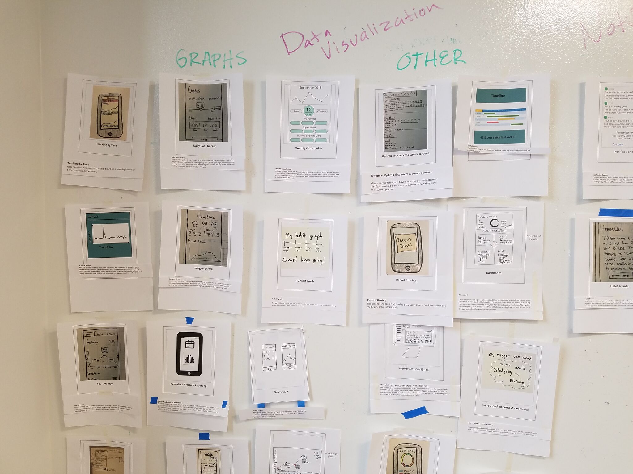
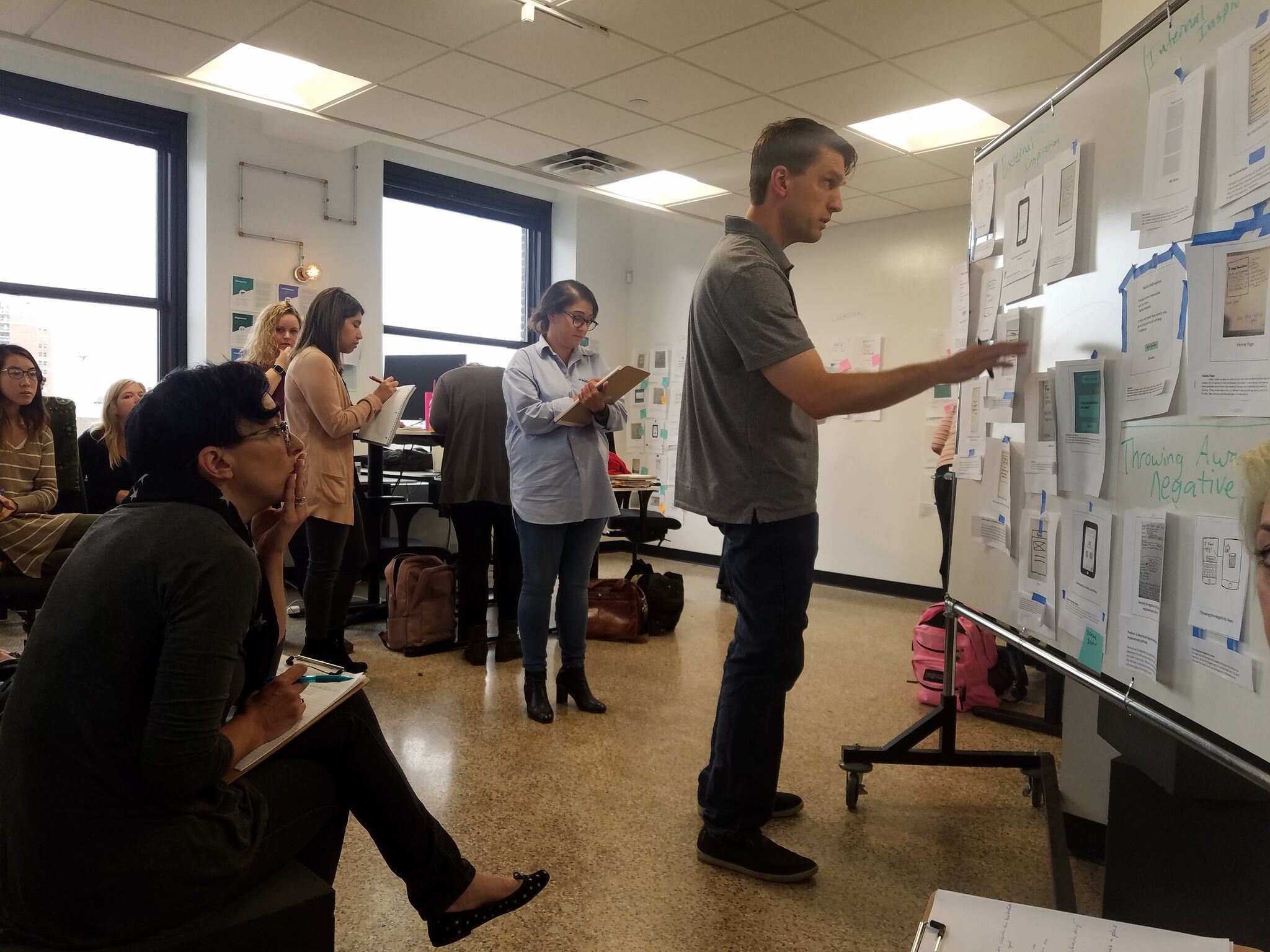
Below are a handful of the rapid prototypes that were created. Aneela and Kirk from HabitAware had the opportunity to look through all of the ideas and work with us to choose what to move forward with.

DEVELOPMENT TIMING
We had the opportunity to work with HabitAware developer, Kirk who looked through the rapid prototypes and doled out timelines and estimates for how long each one would take. This set parameters for what was achievable within the 6 week timeline that was allotted by the HabitAware team.

BRINGING IT ALL TOGETHER
After working with the client to see which features they were most interested in we sent out a survey featuring the top ideas in a Kano Analysis format. This gave more feedback on what Keen users were interested in seeing. After getting the results and synthesizing the feedback I moved forward with a few features that were both what the client thought would be great as well as the ones that had higher ratings in the Kano Analysis.
I moved along to create a journey map of what an average Keen user might experience as well as created wireframes using Sketch to show the client.

Below are the sets of wireframes ranging from the initial low fidelity sketches to the final wireframes that were sent to the client. They received a PDF of the annotated wireframes that walked them through the features of each one as well as an Axure file that simulated how the pages would all work together to improve the users experience.

WRAPPING UP
Working with the Keen team this last week was an amazing experience. The passion they have for improving peoples lives with this technology is incredible and they were very excited about all of the ideas to improve their mobile app and in turn improve the well-being of those who use Keen.